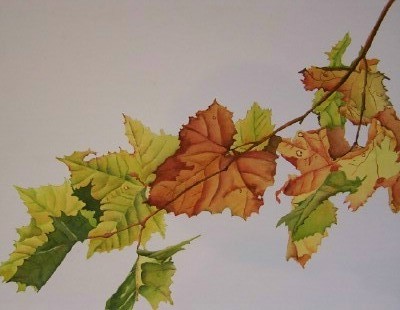
Well, I have finished the leaves - but now am thinking about the background. Which I don't want to work on until I decide which way to hang it - and I need help with that - from YOU! (Yes, I'm talking to you there behind that computer screen!)
So . . . here are all 4 ways -
 |
| Leaves 1 |
 |
Leaves 2
Leaves 3
Leaves 4 |
Let me know which you like best so I can get this thing finished!!!!


I lean toward #4. It keeps the shadowing in the right places and the flow is pleasing.
ReplyDelete#3 seems most pleasing to my eyes! Good luck!
ReplyDeleteHi Deb,
ReplyDeleteI liked it from all sides...
But as you asked, i scrolled up and down many times and concluded that I would choose the second one...
It is upwards and left which symbolizes progress...
the present background is ok...
Or do something which is light...
I almost always prefer a diagonal from lower left to upper right but, in this case, I fell in love with No. 3!!! Beautiful, Deb. And what are you thinking to finish it off and fill that white space?
ReplyDeleteDeb, I would go for leaves 3. There is no rational reason for this choice - I looked quickly at all 4 versions, and my eyes were automatically drawn to this one. However, I think any of these four would work:-)
ReplyDeleteDoes this help?
Hi Deb, I like the Leaves 4. I for some reason can't see the first one. Sometimes it's like this with blogger lately for me. but I love them all, But I'd go with the #4 and do a very dark background varying some of the colors which will make them pop even more. Gorgeous!! take care, Diana
ReplyDeleteThe fourth makes more sense than the other three. Lovely work!
ReplyDeleteI like better the 4th one Deb, looking forward to the next step
ReplyDeleteI prefer the landscape orientation and number 2 looks like it is upside down and kind of awkward. I prefer #4. It seems the most dymanic to me.
ReplyDeleteTo my eyes, 3 has the best flow, followed by 2, then 1 then 4. Beautiful work, Deb.
ReplyDeleteThanks everyone! I've got all the "votes" tallied and taped to my desk - I'll wait for a few more before I make any changes!
ReplyDeletep.s. to Carolyn - BUY DANIEL SMITH paints - they are THE BEST!
I like leave #2 or #4.
ReplyDeleteThese are stunning, I prefer the orientation in #3. Just my 2 cents.
ReplyDeleteI liked #3 best as it seemed a more natural flow. I wonder if preference depends on whether you are right or left handed? I'm right handed, so leaves flowing right works for me. ;-D
ReplyDeleteI think #3 wins out over the others ways. Something about the leaves cascading down from the left catches my eye and is more appealing to me.
ReplyDeleteI am way behind on blogging and by now it is a bit late to vote but I do want to say that the leaves are BEAUTIFUL. I love sycamore leaves. My favorite orientations are 3 or 4.
ReplyDeleteI like #3 and #4 the best. I think #3 is probably my favorite though because of the vertical orientation.
ReplyDeleteThanks again - by my tally #3 wins over #4 9-8. I won't be getting to this immediately, so if I get any more votes those numbers may change before I'm able to finish the painting.
ReplyDeletethree is my favourite
ReplyDeleteLatecomer here, I prefer #3 as well. Yay team! :-)
ReplyDeleteAnother late comer - No: 4 please without any doubt.
ReplyDelete